
Tuesday, December 11, 2012
Movie Poster Process
I started with a light sketch in Photoshop that showed my potential composition.

After I rendered my tree and balloon I moved things around for a better composition. I took snapshots of the trees rendering process but unfortunately I did not know that those snapshot wouldn't save with the original document :( I lost them ALL!

Lastly I added my credits along with the title of the movie and its tagline. A tale of two, at last they meet, to find out why the willow weeps ~

Here is a closer look at the text that I used for the title in the photo below. It is here in the above photo where I felt I was done. But believe it or not things got even more fantastic. I was unable to Upload the final poster as my flash card was full, so I made a drastic decision to leave in on the school computers scratch drive in hopes to come back with an empty drive. I had to class today and as soon as I get there I will post my final. I just wanted to get this up before that.

Tuesday, November 20, 2012
More Ideas for Movie Poster!
So this weekend I did some sketches for my movie poster. I also played around in Adobe Illustrator and created two ideas for the title. Here are the sketches...

Sorry about the quality. So here I have the tree in the back ground an it supported by a giant floating peace of land ( like the ones in Avatar). I added a hot air balloon and came up with the idea to have the two main character inside. I have another idea in my sketchbook but I drew to light and it wont show up on the scanner.
Here are a couple of typefaces I did in Illustrator. I went online and did some more research, but this time I looked for movies that had a similar title containing "The Legend of..." Tat really helped me create my titles.

Thursday, November 15, 2012
Weeping Willow
For the next assignment, which is to come up with an original story and create a movie poster out of it, I have decided to do a children's story. The title of my movie will be called "Weeping Willow." It will be a story about two children, maybe brother and sister or complete strangers, boy and girl, who join together on a magical and adventurous journey to find out why the willow weeps. I'm not sure about the details quite yet but the the children find out about the legend of the tree during an unforeseen circumstance which causes the to meet ( if I go with the strangers idea) to which they decide that it is up to them to find out more about this magical and mysterious tree, while discovering new worlds and meeting new and strange creatures along the way. My initial thought after I came up with my story was the movie "Bridge to Terabithia" so I looked up the poster and it is sort of what I have in mind.


I love the complimentary color theme in this "Pocahontas" poster. For my poster I'm thinking analogous blues or monochrome blue.
Keeping with the Disney theme I found this old "Tarzan" poster. I noticed with many of the Disney movie posters everything was placed centered. I really like the orientation of this poster and how the main character is tiny compared to the massive forest that surrounds him. I was thinking to have my two main character small but underneath a massive willow tree.
Another beautifully done poster for "The Princess and the Frog" Look she's actually underneath a willow tree!
Last but not least, one of my FAVORITE movies of all time! A live-action movie "The Wizard of Oz". I chose a lot of animated movies and I want to go back to a time where special effects weren't as outstanding as they are today. This poster was done in a really interesting way. They managed to fit all of the major elements of the film on the poster and still capture a good since of dynamism. The ruby red slippers, the yellow brick road, Dorothy (well...her legs) and the emerald city of in the distance
I am still working on my sketches for my idea and plan to post some this weekend.
Tuesday, November 6, 2012


Sunday, November 4, 2012
Fun Tile and Gif Creations!
Here is a tile that I created using Illustrator. I then took it, altered the colors and made my first animated gif!


Here is the original tile I created

The Altered colors
I might use this for a scarf, I really like the colors on this one.

And the animation
I have always wanted to learn how to do this so I can start creating my own profile pictures and avatars. I know it's kind of lame but I was trying to keep things simple so I wouldn't overwhelm myself. I did run in to a lot of difficulties and had to figure them out on my own. Maybe by next class if others are finished with there's I'll do something different to it. Can't wait to see what the class has done with their tile. I bet there will be some really awesome animations, seeing that the class is overflowing with creativity and talent. OH! By the way, can you guess what letter I used to create the flowers? Until next time!
Tuesday, October 30, 2012
Flyer for the Upcoming Election
One of the assignments in class was to make a flyer using the things that I have learned so far in Illustrator along with the things that I have learned about typography. The flyer had to be specifically about Prop 30, a proposition that would have great effect on community colleges. Here is the flyer that I came up with.


Tuesday, October 9, 2012
Final
Here is the finished work. Of course there was a lot more I wanted to do and a few things that I wanted to change but for time I had to stop here. Maybe I will nit pick at it a little mor in the future when I am not so busy. Its funny, every time I thought I was do I would find more neat things you could do with Illustrator which made me want to keep exploring. Even though I a Photoshop user, I definitely will use Illustrator again.


Wednesday, October 3, 2012
Work in Progress
Here is my composition for my character. I still have a bit more to do and am not sure about the placement of the character and the cauldron or if I'm going to even include the cauldron. The shadows also need a bit of tweaking as well. I still have to go in and change my character to make her stand out a little more and might even change the color of the clothing. I have it on really low settings for the web so unfortunately the quality is not so good. Sad Face...


Saturday, September 29, 2012
Progress
Here is what my character looks like so far. I still have a ways to go and I'm finding that using Illustrator can get frustrating so its taking me longer to finish than I had planned. A least I'm getting lots of practice.


Thursday, September 27, 2012
Research for Character's Background
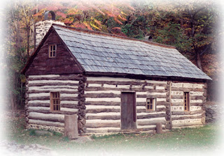
For the background of my character I wanted to have a wooded scene or a forest scene; someplace that looked secluded enough to portray that my character was secretive and up to no good. I did a quick sketch for it but I wasn't quite feeling that it was what I wanted, so I looked online to help broaden my idea. Here are some of the pictures that I found.

This photo is absolutely beautiful to me. I would be great if I could use it as it is seeing that it would be perfect for what I am trying to accomplish. Maybe add a couple of trees. My initial idea was to place my character in the woods surrounded by lots of trees.

Within the background I wanted to place a couple of items like a cauldron and a cabin like the ones I used for my silly bands.

Here is my initial sketch below.

I'm not sure why blogger is rotating my image but here is a second idea after some research.

I intend to add an item or two in the scene as well but for now I just want to get an idea of what I want my background to look like.
Thursday, September 20, 2012
Silly Bands!!
Here are the silly bands that I created. Just for pen tool practice in Illustrator. They are supposed to go with the theme of my character. I'm sure that it is very obvious as to what images they are.

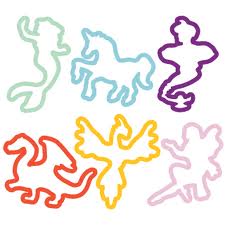


I did not intend for this to go in a Halloween direction of any sort, but with the approaching season I thought why not. So here we have a pumpkin, a cabin, a bat, owl and a cauldron.
Also if you don't know what silly bands are...
Tuesday, September 11, 2012
Character Design
Okay, so here are some sketches I did of my idea. I never posted my work on the internet before so I'm little nervous.

My first design (far left) I felt was good but looked too much like a cat than an owl or bird even and I wanted her to be a lot more graceful and less like a superhero.
My second design I started to loosen up a little and tried to add more feminine qualities while still keeping the owl theme. However I wanted the character to have a purpose and a story...

which is why I'm choosing this one as my final concept. This character seems to have more of a story behind it. I'm excited to take it into Photoshop and play with it some more. Until nextime, bye.
Sunday, September 9, 2012
Character Design References
Well, this feels kinda awkward. Feels like I'm talking to myself. Anywho, as an assignment for my digital class, I am supposed to do sort of a character design. So being the owl lover that I am I decided to create a character based on one. I settled on an half owl half human hybrid...thing. Maybe a witch. I don't know. I'm still working on it. But as some inspiration I found some references online to get me started.
The picture below is the most like my original thought only I want it to have more human like features and clothed.
I very much like this whole concept. And the detail is more of what I had in mind.

So yeah, this weekend I have been working on my idea and it's coming along. I have three sketches and they should be finished by tomorrow. As soon as they are I will post.
The picture below is the most like my original thought only I want it to have more human like features and clothed.
I very much like this whole concept. And the detail is more of what I had in mind.
So yeah, this weekend I have been working on my idea and it's coming along. I have three sketches and they should be finished by tomorrow. As soon as they are I will post.

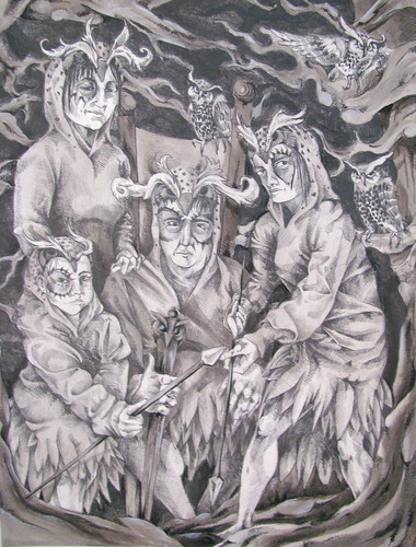
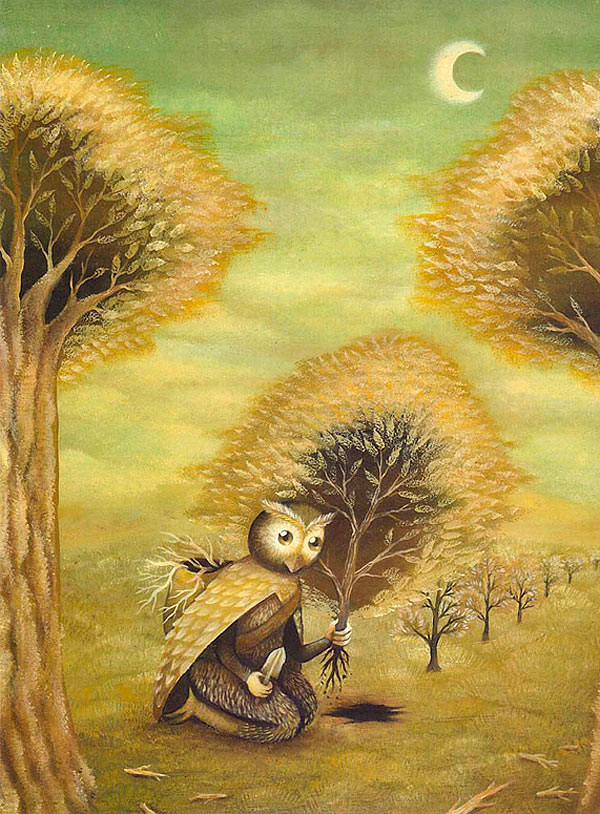
Nicolas Uribe
As soon as I saw Uribes artwork I knew that I had too choose him for my assignment. There is something about Uribe's work that I have never seen before in a painting. There is an obvious sense of time lapse that I absolutely love! I have seen this in films but like I said before never in a still painting. Even though there is no actual sense of time an movement and motion, Uribe makes it easy with his techniques. He also does an excellent job of capturing emotion along with the monotony of everyday tasks.
Here's another..

Subscribe to:
Posts (Atom)